1.4. A High Level Walk-Through
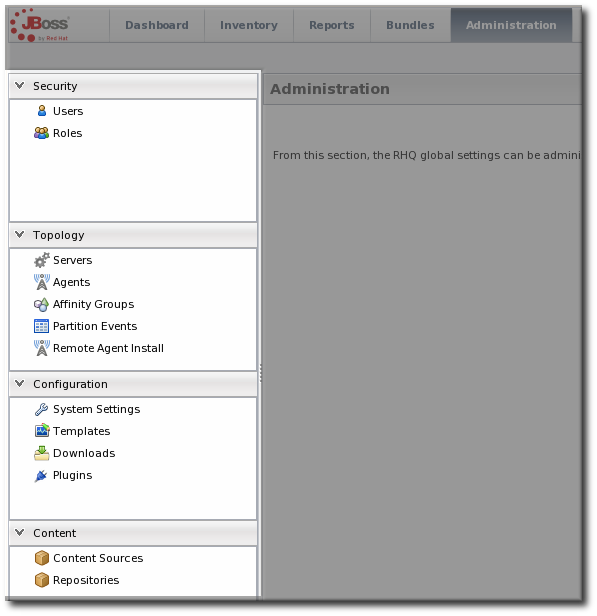
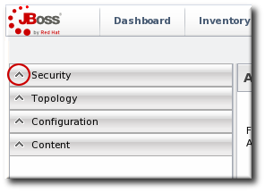
The JBoss ON UI is very rich — there are a lot of small elements that are all layered together to provide a very detailed and flexible interface for interacting with the JBoss ON servers and resources. To maximize its use of space, JBoss ON uses top navigation menus, tabbed browsing with subtabs, active links, and navigation trees to establish relationships between JBoss ON resources and JBoss ON functionality. In a very general view, several types of visual elements that work together to comprise the UI:
- The top menu
- The left menu tables
- The dashboard
- Resource-based tables, which can be for the resource inventory, a summary report, or the results of a search
- Configuration pages which both provide details for and access to elements in JBoss ON, including resources, groups, plug-ins, and JBoss ON server settings
All of these elements fit together in a repeated and reliable pattern.
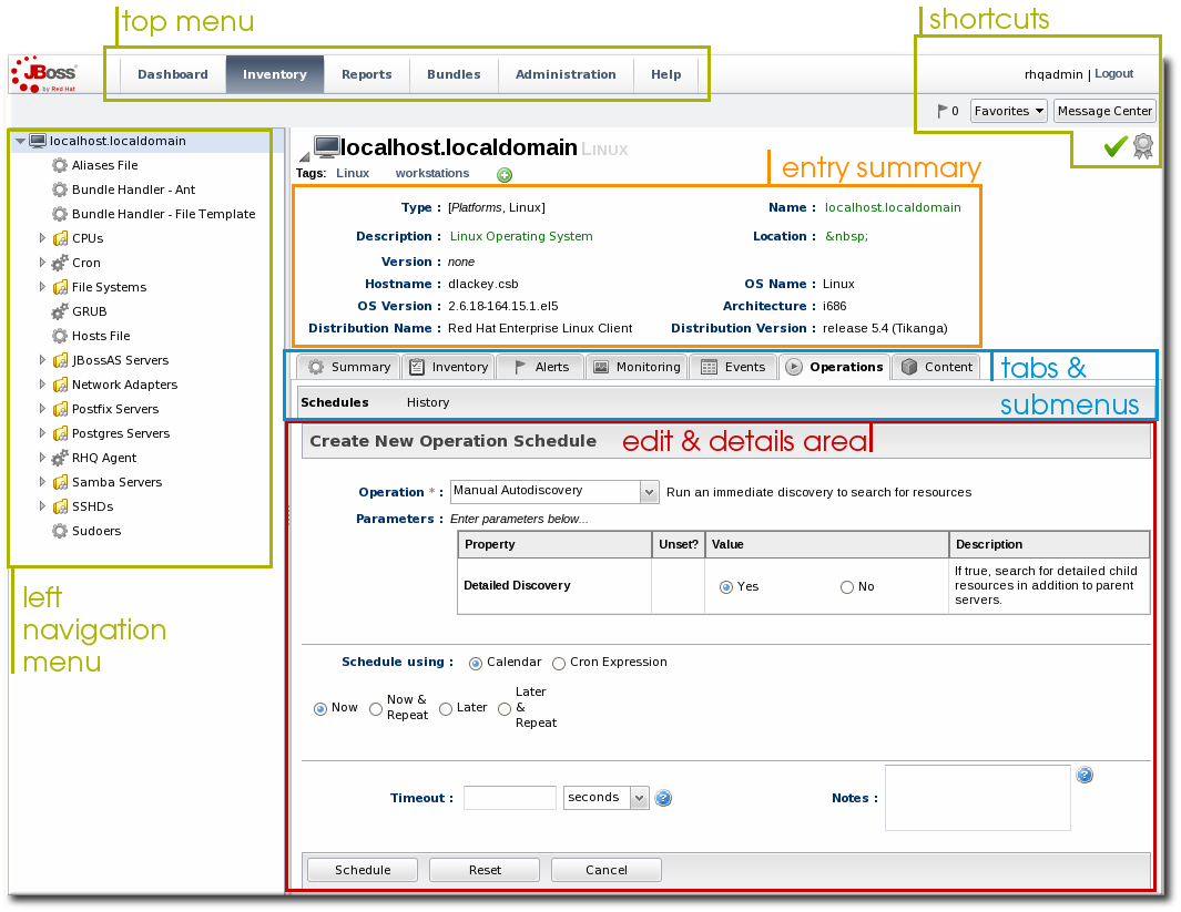
Figure 1.2. UI Elements All Together
Understanding the type of page that you're on can make it easier to navigate through the JBoss ON UI and can help you more completely understand what you can accomplish in JBoss ON.
1.4.3. Dashboard
Copy linkLink copied to clipboard!
The Dashboard is an overview of everything in JBoss ON, from recent actions (fired alerts and operations) to availability reports to newly discovered and imported resources. This page, unlike any other area of JBoss ON, is customizable so it can be used to display only the collection of information that you want to see. Each table of information is called a portlet, a mini-portal into a view of the JBoss ON server or resources. There can be multiple Dashboard views configured, with different portlets or different layouts; these are accessed by tabs at the top of the Dashboard page.
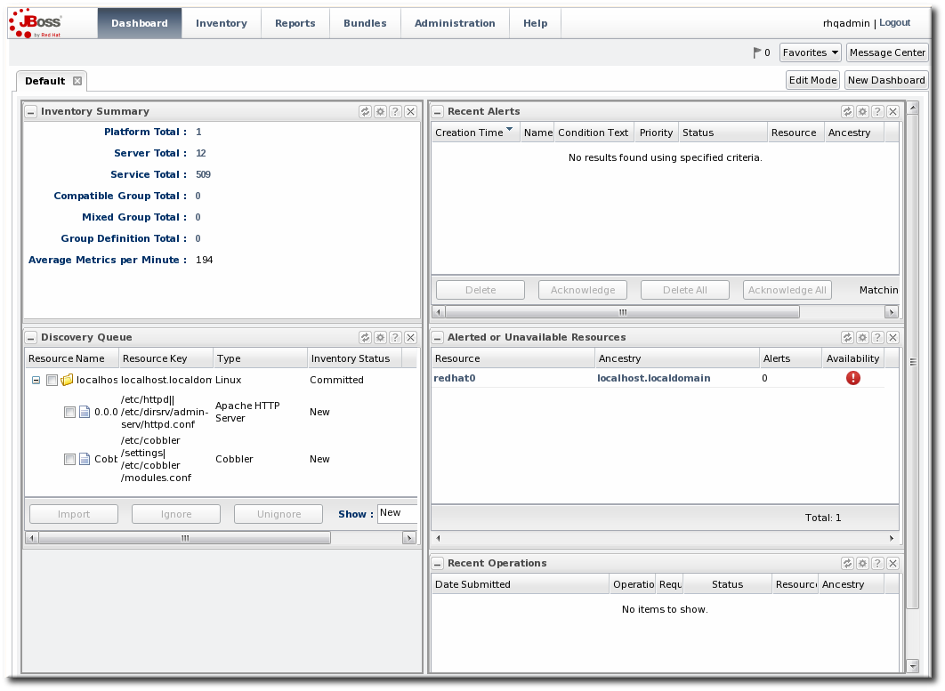
Figure 1.6. Dashboard View
The Dashboard is the landing page for JBoss ON, the first page that comes up after login.
1.4.4. Inventory Browsers and Summaries
Copy linkLink copied to clipboard!
Some pages are essentially long tables of information, presented in basically the same way:
- Tabs for different areas, with subtabs that further break down information
- A table of results
- Icons that open a configuration or task option for that specific entity
- Buttons that perform actions (create, delete, or some other specific action) on the entries; some of these buttons aren't active unless an entry is selected
The inventory interface in Figure 1.7, “Inventory Browser” is rich with functionality. The search bar for resources and groups uses a specialized syntax and flexible dynamic search. Hovering over any resource name gives a small popup message with more information about that resource. Clicking the name of the entry itself opens its default entry configuration page, while clicking the name of its parent opens up that parent resource's configuration page.
Figure 1.7. Inventory Browser
In Figure 1.7, “Inventory Browser”, the button is active because a resource is selected. If no entries are actively selected, activity buttons are grayed out.
1.4.5. Entry Details Pages
Copy linkLink copied to clipboard!
Possibly the most functionality-saturated area in JBoss ON is an entry's details page.
The left navigation area shows the hierarchy, both parents and children, of the selected resource. This makes it very easy to navigate among all of the different services and servers that affect a resource.
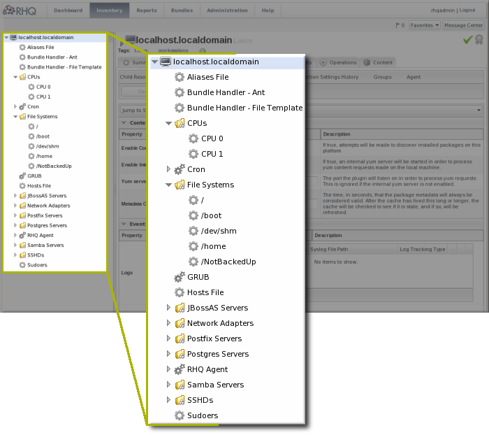
Figure 1.8. Resource Tree
Right-clicking any of the resources in the left navigation opens shortcuts to that entry's configuration.
Note
Resources have short names that are automatically assigned based on their type, instance or system name, or IP address. These names are used in the inventory and in the tree navigation.
The configuration area of a resource entry page (and other JBoss ON entities, like plug-ins and templates) has three information layers that provide all of the possible functionality and tasks available for that entry.
The entry's configuration page is tabbed according to each area that can be configured, and frequently has subtabs for additional configuration options and to show the history of that area (like fired alerts, previous content updates, or monitoring data).
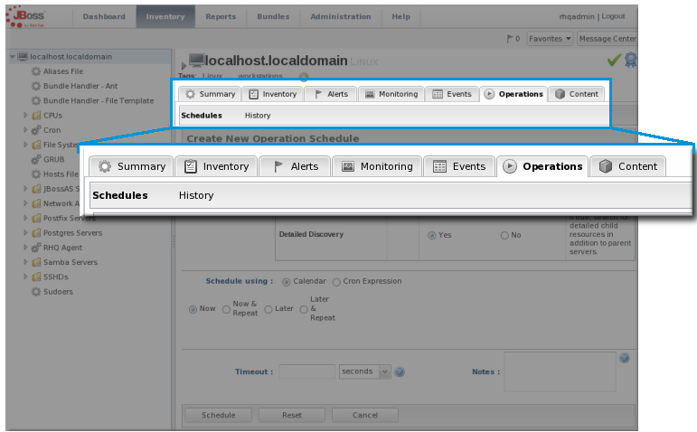
Figure 1.9. Tabs for a Resource Entry
The next section in the entry area shows lists of related configured entries for that task. For example, an Operations area will have a list of available operations in a table below the tabs. For Inventory, there is a list of configured child resources, while Alerts shows all of the configured alerts for that resource. All of those entries are listed in a table similar to the search results available in other parts of the JBoss ON UI.
Many elements are both a details page and an edit page. meaning that many fields are active automatically. This makes it possible to perform management tasks directly, without opening a separate page.
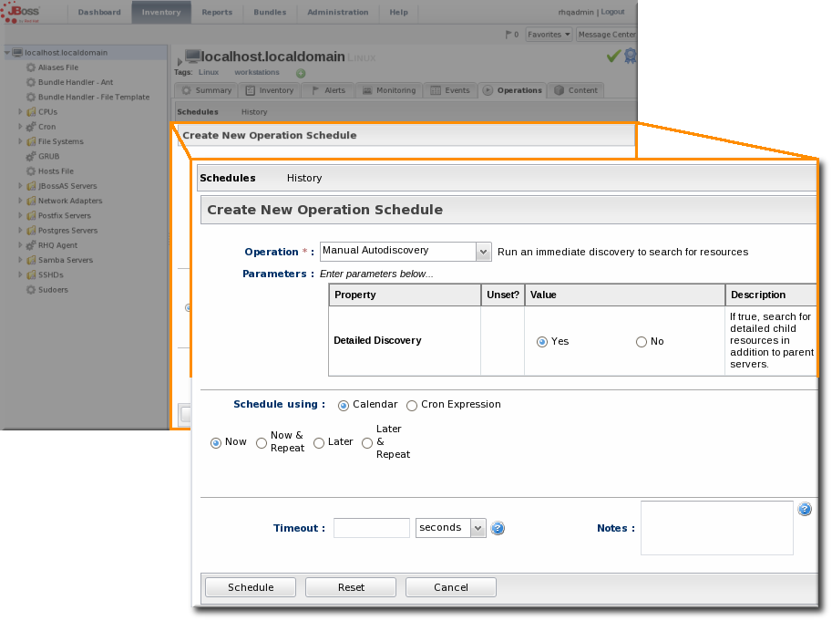
Figure 1.10. Editable Areas for a Resource Entry
1.4.6. Shortcuts in the UI
Copy linkLink copied to clipboard!
To the far right of the top menu is a small cluster of icons that provide very quick, targeted insight into JBoss ON.
- The Message Center shows all notifications that have been sent by the JBoss ON server. This includes alerts, configuration changes, changes to the inventory, or error messages for the server or UI.
- The Favorites button can be used to navigate to selected resources and groups quickly, while the little blue ribbon on resource pages can be used to add that resource to the favorites list.
- The resource available is shown as a green check mark if the resource is available and a red X if the resource is down.

Figure 1.11. Shortcuts

