 Red Hat Summit
Chapter 10. Customizing Red Hat Developer Hub appearance
The following default theme configurations are available for Red Hat Developer Hub:
- The Red Hat Developer Hub theme
- Default theme configurations to make your developer portal look like a standard Red Hat Developer Hub instance. For more information, see Section 10.9, “Default Red Hat Developer Hub theme”
- The Backstage theme
- Default theme configurations to make your developer portal look like a standard Backstage instance. For more information, see Section 10.10, “Default Backstage theme”
You can change or disable particular parameters in a default theme or create a fully customized theme by modifying the app-config-rhdh.yaml file. From the app-config-rhdh.yaml file, you can customize common theme components, including the following:
- Company name and logo
- Font color, size, and style of text in paragraphs, headings, headers, and buttons
- Header color, gradient, and shape
- Button color
- Navigation indicator color
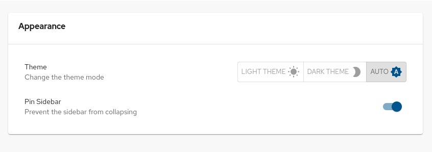
You can also customize some components from the Developer Hub GUI, such as the theme mode (Light Theme, Dark Theme, or Auto).
10.1. Customizing the theme mode for your Developer Hub instance
In Developer Hub, theme configurations are used to change the look and feel of different UI components. So, you might notice changes in different UI components, such as buttons, tabs, sidebars, cards, and tables along with some changes in background color and font used on the RHDH pages.
You can choose one of the following theme modes for your Developer Hub instance:
- Light theme
- Dark theme
- Auto
The default theme mode is Auto, which automatically sets the light or dark theme based on your system preferences.
Prerequisites
- You are logged in to the Developer Hub web console.
Procedure
- From the Developer Hub web console, click Settings.
From the Appearance panel, click LIGHT THEME, DARK THEME, or AUTO to change the theme mode.
10.2. Customizing the branding logo of your Developer Hub instance
You can customize the branding logo of your Developer Hub instance by configuring the branding section in the app-config.yaml file, as shown in the following example:
app:
  branding:
    fullLogo: ${BASE64_EMBEDDED_FULL_LOGO}
iconLogo: ${BASE64_EMBEDDED_ICON_LOGO} where:
- 1
fullLogois the logo on the expanded (pinned) sidebar and expects a base64 encoded image.- 2
iconLogois the logo on the collapsed (unpinned) sidebar and expects a base64 encoded image.You can format the
BASE64_EMBEDDED_FULL_LOGOenvironment variable as follows:BASE64_EMBEDDED_FULL_LOGO: "data:_<media_type>_;base64,<base64_data>"The following example demonstrates how to customize the
BASE64_EMBEDDED_FULL_LOGOusing thedata:_<media_type>_;base64,<base64_data>format:SVGLOGOBASE64=$(base64 -i logo.svg) BASE64_EMBEDDED_FULL_LOGO="data:image/svg+xml;base64,$SVGLOGOBASE64"Replace
image/svg+xmlwith the correct media type for your image (for example,image/pngandimage/jpeg), and adjust the file extension accordingly. As a result, you can embed the logo directly without referencing an external file.
You can also customize the width of the branding logo by setting a value for the fullLogoWidth field in the branding section, as shown in the following example:
app:
  branding:
    fullLogoWidth: 110px
# ...- 1
- The default value for the logo width is
110px. The following units are supported:integer,px,em,rem, percentage.
10.4. Configuring entity tab titles
Red Hat Developer Hub provides a default opinionated tab set for catalog entity views. For consistency with your organization needs, you can rename, reorder, remove, and add tab titles.
Procedure
For each tab to modify, enter your desired values in the
entityTabssection in yourapp-config.yamlfile:upstream: backstage: appConfig: dynamicPlugins: frontend: <plugin_name>: entityTabs: - mountPoint: <mount_point> path: <path> title: <title> priority: <priority><plugin_name>-
Enter the plugin name, such as
backstage-community.plugin-topology. mountPoint-
Enter the tab mountpoint, such as
entity.page.topology. path-
Enter the tab path, such as
/topology. title-
Enter the tab title, such as
Topology. priorityOptional.
To reorder tabs, enter the tab priority, such as
42. Higher priority appears first.To remove a tab, enter a negative value, such as
-1.
10.5. Configuring entity detail tab layout
Each Red Hat Developer Hub entity detail tab has a default opinionated layout. For consistency with your organization needs, you can change the entity detail tab content when the plugin that contributes the tab content allows a configuration.
Prerequisites
-
The plugin that contributes the tab content allows a configuration, such as Developer Hub plugins defining a default configuration in a
configsection.
Procedure
Copy the plugin default configuration in your
app-config.yamlfile, and change thelayoutproperties.global: dynamic: plugins: - package: <package_location> disabled: false pluginConfig: dynamicPlugins: frontend: <plugin_name>: mountPoints: - mountPoint: <mount_point> importName: <import_name> config: layout: gridColumn: lg: span 6 xs: span 12package-
Enter your package location, such as
./dynamic-plugins/dist/backstage-community-plugin-tekton. <plugin_name>-
Enter your plugin name, such as:
backstage-community.plugin-tekton. mountPoint-
Copy the mount point defined in the plugin default configuration, such as:
entity.page.ci/cards. importName-
Copy the import name defined in the plugin default configuration, such as:
TektonCI. layout-
Enter your layout configuration. The tab content is displayed in a responsive grid that uses a 12 column-grid and supports different breakpoints (
xs,sm,md,lg,xl) that can be specified for a CSS property, such asgridColumn. The example uses 6 of the 12 columns to show two Tekton CI cards side-by-side on large (lg) screens (span 6columns) and show them among themselves (xsand abovespan 12columns).
10.6. Customizing the theme mode color palettes for your Developer Hub instance
You can customize the color palettes of the light and dark theme modes in your Developer Hub instance by configuring the light.palette and dark.palette parameters in the branding.theme section of the app-config.yaml file, as shown in the following example:
app:
  branding:
    theme:
      light:
        palette:
          primary:
            main: <light_primary_color>
          navigation:
            indicator: <light_indicator_color>
        pageTheme:
          default:
            backgroundColor: [<light_background_color_1>, <light_background_color_2>]
      dark:
        palette:
          primary:
            main: <dark_primary_color>
          navigation:
            indicator: <dark_indicator_color>
        pageTheme:
          default:
            backgroundColor: [<dark_background_color_1>, <dark_background_color_2>]
# ...- 1
- The main primary color for the light color palette, for example,
#fffffforwhite - 2
- The color of the navigation indicator for the light color palette, which is a vertical bar that indicates the selected tab in the navigation panel, for example,
#FF0000orred - 3
- The background color for the default page theme for the light color palette, for example,
#fffffforwhite - 4
- The main primary color for the dark color palette, for example,
#000000orblack - 5
- The color of the navigation indicator for the dark color palette, which is a vertical bar that indicates the selected tab in the navigation panel, for example,
#FF0000orred - 6
- The background color for the default page theme for the dark color palette, for example,
#000000orblack
Additional resources
10.7. Customizing the page theme header for your Developer Hub instance
You can customize the header color for the light and dark theme modes in your Developer Hub instance by modifying the branding.theme section of the app-config.yaml file. You can also customize the page headers for additional Developer Hub pages, such as the Home, Catalog, and APIs pages.
app:
  branding:
    theme:
      light:
        palette: {}
        pageTheme:
          default:
backgroundColor: "<default_light_background_color>"
fontColor: "<default_light_font_color>"
shape: none
apis:
            backgroundColor: "<apis_light_background_color>"
            fontColor: "<apis_light_font_color>"
            shape: none
      dark:
        palette: {}
        pageTheme:
          default:
            backgroundColor: "<default_dark_background_color>"
            fontColor: "<default_dark_font_color>"
            shape: none
# ...- 1
- The theme mode, for example,
lightordark - 2
- The
yamlheader for the default page theme configuration - 3
- The color of the page header background, for example,
#fffffforwhite - 4
- The color of the text in the page header, for example,
#000000orblack - 5
- The pattern on the page header, for example,
wave,round, ornone - 6
- The
yamlheader for a specific page theme configuration, for example,apis,home
10.8. Customizing the font for your Developer Hub instance
You can configure the typography section of the app-config.yaml file to change the default font family and size of the page text, as well as the font family and size of each heading level, as shown in the following example:
app:
  branding:
    theme:
      light:
        typography:
          fontFamily: "Times New Roman"
          htmlFontSize: 11 # smaller is bigger
          h1:
            fontFamily: "Times New Roman"
            fontSize: 40
          h2:
            fontFamily: "Times New Roman"
            fontSize: 30
          h3:
            fontFamily: "Times New Roman"
            fontSize: 30
          h4:
            fontFamily: "Times New Roman"
            fontSize: 30
          h5:
            fontFamily: "Times New Roman"
            fontSize: 30
          h6:
            fontFamily: "Times New Roman"
            fontSize: 30
      dark:
        typography:
          fontFamily: "Times New Roman"
          htmlFontSize: 11 # smaller is bigger
          h1:
            fontFamily: "Times New Roman"
            fontSize: 40
          h2:
            fontFamily: "Times New Roman"
            fontSize: 30
          h3:
            fontFamily: "Times New Roman"
            fontSize: 30
          h4:
            fontFamily: "Times New Roman"
            fontSize: 30
          h5:
            fontFamily: "Times New Roman"
            fontSize: 30
          h6:
            fontFamily: "Times New Roman"
            fontSize: 30
# ...
10.9. Default Red Hat Developer Hub theme
You can use the default Red Hat Developer Hub theme configurations to make your Developer Hub instance look like a standard Red Hat Developer Hub instance. You can also modify the app-config.yaml file to customize or disable particular parameters.
10.9.1. Default Red Hat Developer Hub theme color palette
The app-config.yaml file uses the following configurations for the default Red Hat Developer Hub color palette:
app:
  branding:
    theme:
      light:
        variant: "rhdh"
        mode: "light"
        palette:
          background:
            default: "#F8F8F8"
            paper: "#FFFFFF"
          banner:
            closeButtonColor: "#FFFFFF"
            error: "#E22134"
            info: "#2E77D0"
            link: "#000000"
            text: "#FFFFFF"
            warning: "#FF9800"
          border: "#E6E6E6"
          bursts:
            backgroundColor:
              default: "#7C3699"
            fontColor: "#FEFEFE"
            gradient:
              linear: "linear-gradient(-137deg, #4BB8A5 0%, #187656 100%)"
            slackChannelText: "#ddd"
          errorBackground: "#FFEBEE"
          errorText: "#CA001B"
          gold: "#FFD600"
          highlight: "#FFFBCC"
          infoBackground: "#ebf5ff"
          infoText: "#004e8a"
          link: "#0A6EBE"
          linkHover: "#2196F3"
          mode: "light"
          navigation:
            background: "#222427"
            indicator: "#0066CC"
            color: "#ffffff"
            selectedColor: "#ffffff"
            navItem:
              hoverBackground: "#3c3f42"
            submenu:
              background: "#222427"
          pinSidebarButton:
            background: "#BDBDBD"
            icon: "#181818"
          primary:
            main: "#0066CC"
          secondary:
            main: "#8476D1"
          status:
            aborted: "#757575"
            error: "#E22134"
            ok: "#1DB954"
            pending: "#FFED51"
            running: "#1F5493"
            warning: "#FF9800"
          tabbar:
            indicator: "#9BF0E1"
          textContrast: "#000000"
          textSubtle: "#6E6E6E"
          textVerySubtle: "#DDD"
          warningBackground: "#F59B23"
          warningText: "#000000"
          text:
            primary: "#151515"
            secondary: "#757575"
          rhdh:
            general:
              disabledBackground: "#D2D2D2"
              disabled: "#6A6E73"
              searchBarBorderColor: "#E4E4E4"
              formControlBackgroundColor: "#FFF"
              mainSectionBackgroundColor: "#FFF"
              headerBottomBorderColor: "#C7C7C7"
              cardBackgroundColor: "#FFF"
              sidebarBackgroundColor: "#212427"
              cardBorderColor: "#C7C7C7"
              tableTitleColor: "#181818"
              tableSubtitleColor: "#616161"
              tableColumnTitleColor: "#151515"
              tableRowHover: "#F5F5F5"
              tableBorderColor: "#E0E0E0"
              tableBackgroundColor: "#FFF"
              tabsBottomBorderColor: "#D2D2D2"
              contrastText: "#FFF"
            primary:
              main: "#0066CC"
              focusVisibleBorder: "#0066CC"
            secondary:
              main: "#8476D1"
              focusVisibleBorder: "#8476D1"
            cards:
              headerTextColor: "#151515"
              headerBackgroundColor: "#FFF"
              headerBackgroundImage: "none"

      dark:
        variant: "rhdh"
        mode: "dark"
        palette:
          background:
            default: "#333333"
            paper: "#424242"
          banner:
            closeButtonColor: "#FFFFFF"
            error: "#E22134"
            info: "#2E77D0"
            link: "#000000"
            text: "#FFFFFF"
            warning: "#FF9800"
          border: "#E6E6E6"
          bursts:
            backgroundColor:
              default: "#7C3699"
            fontColor: "#FEFEFE"
            gradient:
              linear: "linear-gradient(-137deg, #4BB8A5 0%, #187656 100%)"
            slackChannelText: "#ddd"
          errorBackground: "#FFEBEE"
          errorText: "#CA001B"
          gold: "#FFD600"
          highlight: "#FFFBCC"
          infoBackground: "#ebf5ff"
          infoText: "#004e8a"
          link: "#9CC9FF"
          linkHover: "#82BAFD"
          mode: "dark"
          navigation:
            background: "#0f1214"
            indicator: "#0066CC"
            color: "#ffffff"
            selectedColor: "#ffffff"
            navItem:
              hoverBackground: "#3c3f42"
            submenu:
              background: "#0f1214"
          pinSidebarButton:
            background: "#BDBDBD"
            icon: "#404040"
          primary:
            main: "#1FA7F8"
          secondary:
            main: "#B2A3FF"
          status:
            aborted: "#9E9E9E"
            error: "#F84C55"
            ok: "#71CF88"
            pending: "#FEF071"
            running: "#3488E3"
            warning: "#FFB84D"
          tabbar:
            indicator: "#9BF0E1"
          textContrast: "#FFFFFF"
          textSubtle: "#CCCCCC"
          textVerySubtle: "#727272"
          warningBackground: "#F59B23"
          warningText: "#000000"

          rhdh:
            general:
              disabledBackground: "#444548"
              disabled: "#AAABAC"
              searchBarBorderColor: "#57585a"
              formControlBackgroundColor: "#36373A"
              mainSectionBackgroundColor: "#0f1214"
              headerBottomBorderColor: "#A3A3A3"
              cardBackgroundColor: "#292929"
              sidebarBackgroundColor: "#1b1d21"
              cardBorderColor: "#A3A3A3"
              tableTitleColor: "#E0E0E0"
              tableSubtitleColor: "#E0E0E0"
              tableColumnTitleColor: "#E0E0E0"
              tableRowHover: "#0f1214"
              tableBorderColor: "#515151"
              tableBackgroundColor: "#1b1d21"
              tabsBottomBorderColor: "#444548"
              contrastText: "#FFF"
            primary:
              main: "#1FA7F8"
              focusVisibleBorder: "#ADD6FF"
            secondary:
              main: "#B2A3FF"
              focusVisibleBorder: "#D0C7FF"
            cards:
              headerTextColor: "#FFF"
              headerBackgroundColor: "#0f1214"
              headerBackgroundImage: "none"
Alternatively, you can use the following variant and mode values in the app-config.yaml file to apply the previous default configuration:
app:
  branding:
    theme:
      light:
        variant: "rhdh"
        mode: "light"
      dark:
        variant: "rhdh"
        mode: "dark"
10.9.2. Default Red Hat Developer Hub page themes
The default Developer Hub header color is white in light mode and black in dark mode, as shown in the following app-config.yaml file configuration:
app:
  branding:
    theme:
      light:
        palette: {}
        defaultPageTheme: default
        pageTheme:
          default:
            backgroundColor: "#ffffff"
      dark:
        palette: {}
        defaultPageTheme: default
        pageTheme:
          default:
            backgroundColor: "#0f1214"
10.10. Default Backstage theme
You can use the default Backstage theme configurations to make your Developer Hub instance look like a standard Backstage instance. You can also modify the app-config.yaml file to customize or disable particular parameters.
10.10.1. Default Backstage theme color palette
The app-config.yaml file uses the following configurations for the default Backstage color palette:
app:
  branding:
    theme:
      light:
        variant: "backstage"
        mode: "light"
        palette:
          background:
            default: "#F8F8F8"
            paper: "#FFFFFF"
          banner:
            closeButtonColor: "#FFFFFF"
            error: "#E22134"
            info: "#2E77D0"
            link: "#000000"
            text: "#FFFFFF"
            warning: "#FF9800"
          border: "#E6E6E6"
          bursts:
            backgroundColor:
              default: "#7C3699"
            fontColor: "#FEFEFE"
            gradient:
              linear: "linear-gradient(-137deg, #4BB8A5 0%, #187656 100%)"
            slackChannelText: "#ddd"
          errorBackground: "#FFEBEE"
          errorText: "#CA001B"
          gold: "#FFD600"
          highlight: "#FFFBCC"
          infoBackground: "#ebf5ff"
          infoText: "#004e8a"
          link: "#0A6EBE"
          linkHover: "#2196F3"
          navigation:
            background: "#171717"
            color: "#b5b5b5"
            indicator: "#9BF0E1"
            navItem:
              hoverBackground: "#404040"
            selectedColor: "#FFF"
            submenu:
              background: "#404040"
          pinSidebarButton:
            background: "#BDBDBD"
            icon: "#181818"
          primary:
            main: "#1F5493"
          status:
            aborted: "#757575"
            error: "#E22134"
            ok: "#1DB954"
            pending: "#FFED51"
            running: "#1F5493"
            warning: "#FF9800"
          tabbar:
            indicator: "#9BF0E1"
          textContrast: "#000000"
          textSubtle: "#6E6E6E"
          textVerySubtle: "#DDD"
          warningBackground: "#F59B23"
          warningText: "#000000"

      dark:
        variant: "backstage"
        mode: "dark"
        palette:
          background:
            default: "#333333"
            paper: "#424242"
          banner:
            closeButtonColor: "#FFFFFF"
            error: "#E22134"
            info: "#2E77D0"
            link: "#000000"
            text: "#FFFFFF"
            warning: "#FF9800"
          border: "#E6E6E6"
          bursts:
            backgroundColor:
              default: "#7C3699"
            fontColor: "#FEFEFE"
            gradient:
              linear: "linear-gradient(-137deg, #4BB8A5 0%, #187656 100%)"
            slackChannelText: "#ddd"
          errorBackground: "#FFEBEE"
          errorText: "#CA001B"
          gold: "#FFD600"
          highlight: "#FFFBCC"
          infoBackground: "#ebf5ff"
          infoText: "#004e8a"
          link: "#9CC9FF"
          linkHover: "#82BAFD"
          mode: "dark"
          navigation:
            background: "#424242"
            color: "#b5b5b5"
            indicator: "#9BF0E1"
            navItem:
              hoverBackground: "#404040"
            selectedColor: "#FFF"
            submenu:
              background: "#404040"
          pinSidebarButton:
            background: "#BDBDBD"
            icon: "#404040"
          primary:
            dark: "#82BAFD"
            main: "#9CC9FF"
          secondary:
            main: "#FF88B2"
          status:
            aborted: "#9E9E9E"
            error: "#F84C55"
            ok: "#71CF88"
            pending: "#FEF071"
            running: "#3488E3"
            warning: "#FFB84D"
          tabbar:
            indicator: "#9BF0E1"
          textContrast: "#FFFFFF"
          textSubtle: "#CCCCCC"
          textVerySubtle: "#727272"
          warningBackground: "#F59B23"
          warningText: "#000000"
Alternatively, you can use the following variant and mode values in the app-config.yaml file to apply the previous default configuration:
app:
  branding:
    theme:
      light:
        variant: "backstage"
        mode: "light"
      dark:
        variant: "backstage"
        mode: "dark"
10.10.2. Default Backstage page themes
The default Backstage header color is white in light mode and black in dark mode, as shown in the following app-config.yaml file configuration:
app:
  branding:
    theme:
      light:
        palette: {}
        defaultPageTheme: default
        pageTheme:
          default:
            backgroundColor: ['#005B4B'] # teal
            fontColor: '#ffffff'
            shape: wave
          documentation:
            backgroundColor: ['#C8077A', '#C2297D'] # pinkSea
            fontColor: '#ffffff'
            shape: wave2
          tool:
            backgroundColor: ['#8912CA', '#3E00EA'] # purpleSky
            fontColor: '#ffffff'
            shape: round
          service:
            backgroundColor: ['#006D8F', '#0049A1'] # marineBlue
            fontColor: '#ffffff'
            shape: wave
          website:
            backgroundColor: ['#0027AF', '#270094'] # veryBlue
            fontColor: '#ffffff'
            shape: wave
          library:
            backgroundColor: ['#98002B', '#8D1134'] # rubyRed
            fontColor: '#ffffff'
            shape: wave
          other:
            backgroundColor: ['#171717', '#383838'] # darkGrey
            fontColor: '#ffffff'
            shape: wave
          app:
            backgroundColor: ['#BE2200', '#A41D00'] # toastyOrange
            fontColor: '#ffffff'
            shape: shapes.wave
          apis:
            backgroundColor: ['#005B4B'] # teal
            fontColor: '#ffffff'
            shape: wave2
          card:
            backgroundColor: ['#4BB8A5', '#187656'] # greens
            fontColor: '#ffffff'
            shape: wave

      dark:
        palette: {}
        defaultPageTheme: default
        pageTheme:
          default:
            backgroundColor: ['#005B4B'] # teal
            fontColor: '#ffffff'
            shape: wave
          documentation:
            backgroundColor: ['#C8077A', '#C2297D'] # pinkSea
            fontColor: '#ffffff'
            shape: wave2
          tool:
            backgroundColor: ['#8912CA', '#3E00EA'] # purpleSky
            fontColor: '#ffffff'
            shape: round
          service:
            backgroundColor: ['#006D8F', '#0049A1'] # marineBlue
            fontColor: '#ffffff'
            shape: wave
          website:
            backgroundColor: ['#0027AF', '#270094'] # veryBlue
            fontColor: '#ffffff'
            shape: wave
          library:
            backgroundColor: ['#98002B', '#8D1134'] # rubyRed
            fontColor: '#ffffff'
            shape: wave
          other:
            backgroundColor: ['#171717', '#383838'] # darkGrey
            fontColor: '#ffffff'
            shape: wave
          app:
            backgroundColor: ['#BE2200', '#A41D00'] # toastyOrange
            fontColor: '#ffffff'
            shape: shapes.wave
          apis:
            backgroundColor: ['#005B4B'] # teal
            fontColor: '#ffffff'
            shape: wave2
          card:
            backgroundColor: ['#4BB8A5', '#187656'] # greens
            fontColor: '#ffffff'
            shape: wave
10.11. Loading a custom Developer Hub theme by using a dynamic plugin
You can load a custom Developer Hub theme from a dynamic plugin.
Procedure
Export a theme provider function in your dynamic plugin, for example:
Sample
myTheme.tsfragmentimport { lightTheme } from './lightTheme'; // some custom theme import { UnifiedThemeProvider } from '@backstage/theme'; export const lightThemeProvider = ({ children }: { children: ReactNode }) => ( <UnifiedThemeProvider theme={lightTheme} children={children} /> );For more information about creating a custom theme, see Backstage documentation - Creating a Custom Theme.
Configure Developer Hub to load the theme in the UI by using the
themesconfiguration field:app-config.yamlfragmentdynamicPlugins: frontend: example.my-custom-theme-plugin: themes: - id: light1 title: Light variant: light icon: someIconReference importName: lightThemeProvider- 1
- Set your theme ID by specifying the desired value. Optionally, override the default Developer Hub themes by using the following ID values:
lightto replace the default light theme, ordarkto replace the default dark theme.
Verification
- The theme is available in the Developer Hub Settings page.
10.12. Custom component options for your Developer Hub instance
There are two component variants that you can use to customize various components of your Developer Hub theme:
- Patternfly
- MUI
In addition to assigning a component variant to each parameter in the light or dark theme mode configurations, you can toggle the rippleEffect on or off.
The following code shows the options that you can use in the app-config.yaml file to configure the theme components for your Developer Hub instance:
app:
  branding:
    theme:
      light:
        options:
          rippleEffect: off / on
          paper: patternfly / mui
          buttons: patternfly / mui
          inputs: patternfly / mui
          accordions: patternfly / mui
          sidebars: patternfly / mui
          pages: patternfly / mui
          headers: patternfly / mui
          toolbars: patternfly / mui
          dialogs: patternfly / mui
          cards: patternfly / mui
          tables: patternfly / mui
          tabs: patternfly / mui
      dark:
        options:
          rippleEffect: off / on
          paper: patternfly / mui
          buttons: patternfly / mui
          inputs: patternfly / mui
          accordions: patternfly / mui
          sidebars: patternfly / mui
          pages: patternfly / mui
          headers: patternfly / mui
          toolbars: patternfly / mui
          dialogs: patternfly / mui
          cards: patternfly / mui
          tables: patternfly / mui
          tabs: patternfly / mui
'%20d='M201.5%20305.5c-13.8%200-24.9-11.1-24.9-24.6%200-13.8%2011.1-24.9%2024.9-24.9%2013.6%200%2024.6%2011.1%2024.6%2024.9%200%2013.6-11.1%2024.6-24.6%2024.6zM504%20256c0%20137-111%20248-248%20248S8%20393%208%20256%20119%208%20256%208s248%20111%20248%20248zm-132.3-41.2c-9.4%200-17.7%203.9-23.8%2010-22.4-15.5-52.6-25.5-86.1-26.6l17.4-78.3%2055.4%2012.5c0%2013.6%2011.1%2024.6%2024.6%2024.6%2013.8%200%2024.9-11.3%2024.9-24.9s-11.1-24.9-24.9-24.9c-9.7%200-18%205.8-22.1%2013.8l-61.2-13.6c-3-.8-6.1%201.4-6.9%204.4l-19.1%2086.4c-33.2%201.4-63.1%2011.3-85.5%2026.8-6.1-6.4-14.7-10.2-24.1-10.2-34.9%200-46.3%2046.9-14.4%2062.8-1.1%205-1.7%2010.2-1.7%2015.5%200%2052.6%2059.2%2095.2%20132%2095.2%2073.1%200%20132.3-42.6%20132.3-95.2%200-5.3-.6-10.8-1.9-15.8%2031.3-16%2019.8-62.5-14.9-62.5zM302.8%20331c-18.2%2018.2-76.1%2017.9-93.6%200-2.2-2.2-6.1-2.2-8.3%200-2.5%202.5-2.5%206.4%200%208.6%2022.8%2022.8%2087.3%2022.8%20110.2%200%202.5-2.2%202.5-6.1%200-8.6-2.2-2.2-6.1-2.2-8.3%200zm7.7-75c-13.6%200-24.6%2011.1-24.6%2024.9%200%2013.6%2011.1%2024.6%2024.6%2024.6%2013.8%200%2024.9-11.1%2024.9-24.6%200-13.8-11-24.9-24.9-24.9z'/%3e%3c/svg%3e)