此内容没有您所选择的语言版本。
Chapter 5. Monitoring Dashboard and Concepts
The Monitoring Dashboard provides high level visual information on health, performance and utilization of cluster wide resources.
5.1. Dashboard Selector
The Dashboard Selector is the primary navigation tool to move between different dashboards.
Figure 5.1. Dashboard Selector

5.2. Dashboard Panels
The Dashboard is composed of individual visualization blocks displaying different metrics and statistics termed as Panels. The panels exhibit different colors based on the current status of the metrics. Panels can be dragged and dropped and rearranged on the Dashboard.
Figure 5.2. Dashboard Panels

There are following types of panels available to visualize monitoring data:
- Graph: The Graph panel allows to visualize unrestrained amounts of metrics. The Connection Trend and the Throughput Trend are examples of Graph panel.
Figure 5.3. Graph Panel Example

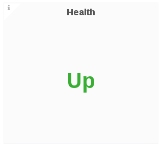
- Singlestat: The Singlestat panel displays the aggregated value of a series in a single number data. For example, the Health, volume, snapshots are Singlestat panels.
Figure 5.4. Singestat Panel Example
5.3. Dashboard Rows
A row is a logical divider in a given Dashboard. The panels of the dashboard are arranged and organized in rows to give a streamlined look and visual.
5.4. Dashboard Color Codes
The Dashboard panels text displays the following color codes to represent health status information:
- Green: Healthy
- Orange: Degraded
- Red: Unhealthy, Down, or Unavailable