Ce contenu n'est pas disponible dans la langue sélectionnée.
17.3. Resource-Level Metrics Charts
The Monitoring tab for a resource (or for a compatible group) has a series of different subtabs, each marking a different type of monitoring data. Each data group has its own monitoring charts.
- Section 19.2, “Viewing Metrics and Baseline Charts” for graphs and tables of the same metrics information
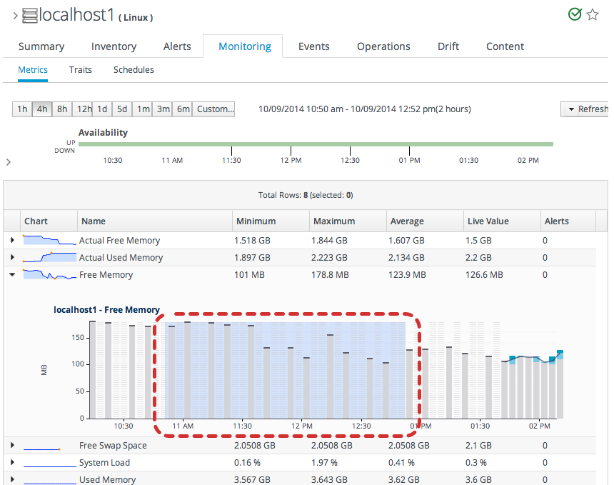
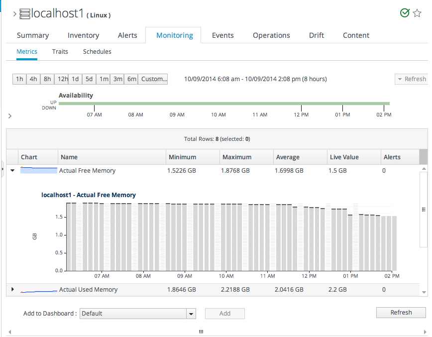
The Metrics subtab initially displays a table, laid out with the maximum, minimum, and average values for the baseline period for the metric, the most recent reading, and a trendline. Expanding any given metric shows a graph with the same information, displayed visually.
Figure 17.4. Metrics Chart
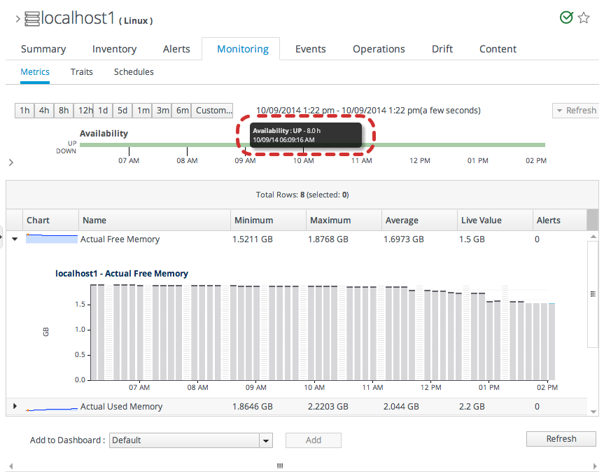
Hovering over any given data point shows the value of that aggregated point (which corresponds to the time period for the size of the graph: the average value for one-sixtieth, 1/60, of the total graphed period; for example, for a 60-hour graph, a data point is one hour).
Figure 17.5. Hovering over a Data Point
There are buttons at the top of the Metrics tab to change the date range for the displayed data. Additionally, it is possible to drag over a portion of the graph and generate a new graph, based on the free selected range.
Figure 17.6. Selecting a Subset of the Graph