Ce contenu n'est pas disponible dans la langue sélectionnée.
Chapter 7. Monitoring Dashboard and Concepts
The Monitoring Dashboard provides high level visual information on health, performance and utilization of cluster wide resources.
7.1. Dashboard Selector
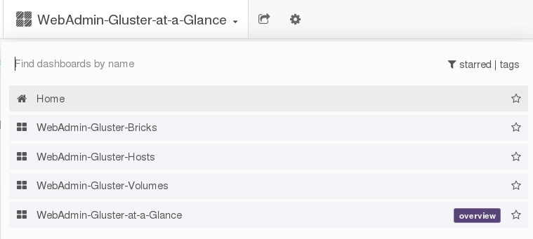
The Dashboard Selector is the primary navigation tool to move between different dashboards.
Figure 7.1. Dashboard Selector
7.2. Dashboard Panels
The Dashboard is composed of individual visualization blocks displaying different metrics and statistics termed as Panels. The panels exhibit different data based on the current status of the cluster component. Panels can be dragged and dropped and rearranged on the Dashboard.
The following are the types of panels available to visualize monitoring data:
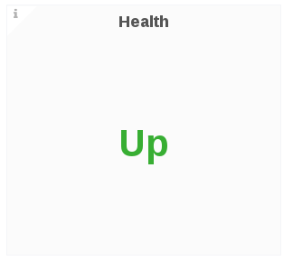
Single Status Panel: The status panel displays the aggregated value of a series in e a single number data. For example, the Health, volume, snapshots are Singlestat panels.
Figure 7.2. Single Status Panel Example
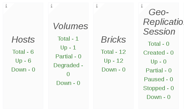
Multiple Status Panel: The Multiple status panel displays multiple values of a data source. The multiple status panel displays:
- The severity of the component
- If the component is disabled
Extra data in the panel about the component
Figure 7.3. Multiple Status Panel Example
 Note
NoteIf a multitple status panel displays Invalid Number as a status for a component, it indicates there is no data available to display from the time series database.
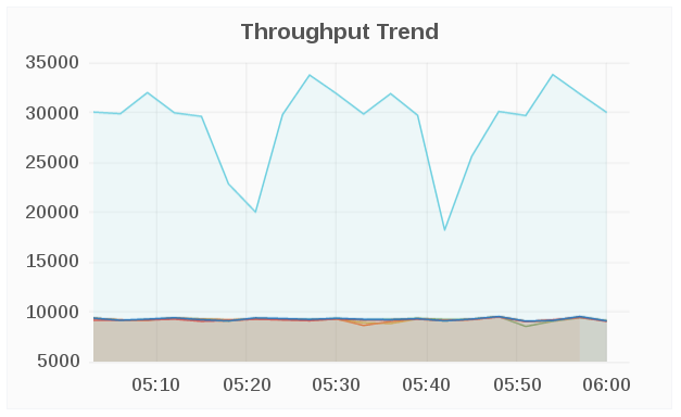
Graph Panel: The Graph panel allows to visualize unrestrained amounts of metrics. The Connection Trend and the Throughput Trend are examples of Graph panel.
Figure 7.4. Graph Panel Example
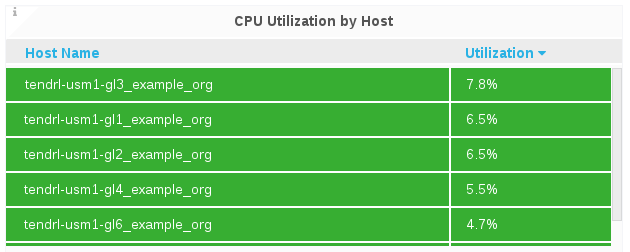
- Table Panel: The Graph panel allows to visualize unrestrained amounts of metrics. The Connection Trend and the Throughput Trend are examples of Graph panel.
Figure 7.5. Table Panel Example
7.3. Dashboard Rows
A row is a logical divider in a given Dashboard. The panels of the dashboard are arranged and organized in rows to give a streamlined look and visual.
7.4. Dashboard Color Codes
The Dashboard panels text displays the following color codes to represent health status information:
- Green: Healthy
- Orange: Degraded
- Red: Unhealthy, Down, or Unavailable