Ce contenu n'est pas disponible dans la langue sélectionnée.
Chapter 55. Page authoring
Pages are collections of following components:
- Core components
- Navigational components
- Reporting components
- Heatmaps
Also, a page can have none or any number of components. The Page Editor tool is used to edit the pages.
A page has either the Fluid style or the Page style. The Fluid style is a classical web page with a vertical scroll bar, when the page exceeds the available height. The Page style is a web page that will always fit to the windows height.
55.1. Creating pages
You can use the Pages perspective to create a page that consists of different types of components. After a page has been created and all the components in it defined, use the Page Editor to save, delete, rename, or copy pages as required.
The following procedure describes how to create a page and add the required components to it:
Procedure
-
In Business Central, go to Menu
Design Pages. - In the Pages panel, click New. Alternatively, click New Page on the Page Editor pane.
- In the New Page dialog box, enter a value in the Name field and select the required style.
- Click Ok. The new page opens in the Page Editor.
- In the Components pane, expand the components and drag the required component types to the editor canvass.
- After placing the components on the page, edit its properties from the Properties pane.
- Click Save and then click Save again.
55.2. Saving, deleting, renaming, or copying pages
After you have created and defined a page, use the Page Editor to save, delete, rename, or copy pages as required.
Procedure
-
In Business Central, go to Menu
Design Pages. - Select a page from the Pages panel. The page opens in the Page Editor.
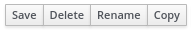
- Perform the desired operation and select Save, Delete, Rename, or Copy from the upper right corner of the Page Editor.
Figure 55.1. Save, delete, rename, or copy pages
55.3. Navigation tree
The Workbench navigation tree contains the entries that are displayed in Business Central’s Main menu. Changes to this navigation tree structure will be reflected in the Main menu on the Home page. Such mechanism can be used, for example, to publish new pages.
Also, additional navigation trees can be created. These custom trees can be used to configure the navigation components within a page. You cannot delete the Workbench tree from the Navigation panel but you can edit the Workbench tree hierarchy to suit your requirements. This feature helps users customize the Main menu of Business Central with new pages.
The Workbench tree, which appears by default in the Navigation panel, is the Main menu of Business Central.
55.4. Components
A page contains different types of components. You can use the following component types on a page using the Components panel:
- Core components
- Navigation components
- Reporting components
- Heatmap components
55.4.1. Core components
You can use the Core components to specify custom HTML information or display existing pages. There are three types of core components.
Core components are not mandatory.
| Core component sub-types | Description |
|---|---|
| HTML | This component opens an HTML editor widget that is used to create HTML pages using text, images, tables, links, and colors. You can also customize an HTML page if required. |
| Page | This component enables you to add previously created HTML pages to a new dashboard. You can use this component to nest custom pages that you have already created in your dashboard. |
| Logo | This component enables you to add images on the page. To add images on a page, you can provide a URL for the image and set the width and height of the image as per your requirements. The default image is the logo of Dashbuilder. The Logo URL field is mandatory. |
55.4.3. Reporting components
The Reporting components are used to display the data from data sets in the form of graphs, tables, maps. There are eleven types of reporting components. For more information about the data sets, see Data sets authoring section.
You can configure the reporting components using the New Displayer widget, which contains the following tabs:
- Type: Enables you to select how to display custom data graphically.
- Data: Enables you to select a data set from the list of custom data sets that you created from the Data Sets section available in the Settings menu.
- Display: Enables you to select and customize how the content is displayed by adding titles, changing colors, size.
For Time Series Chart component, the New Displayer widget contains the Data, Display, and Component Editor tabs.
| Reporting component sub-types | Description |
|---|---|
| Bar | This component is used to display the data from data sets in a bar chart form. |
| Pie | This component is used to display the data from data sets in the form of pie chart form. In a pie chart, the arc length of each slice is proportional to the represented quantity. |
| Line | This component is used to display the data from data sets as a series of data points connected by straight line segments on two axes. |
| Area | This component combines a line chart and a bar chart to display the data from data sets. |
| Bubble | This component displays multiple circles (bubbles) in a two-dimensional plot. It is a generalization of the scatter plot that replaces the dots with bubbles. |
| Meter | This component is used to display the data from data sets in a meter form. |
| Map | This component enables you to o position your data in a context, often geographical, using different layers. The data values are displayed as markers on the map. The data values can act as coordinates or addresses. |
| Metric | This component is used to display the data from data sets in a metric form. You can use the Preview, HTML, or Javascript tab to edit your data. |
| Table | This component is used to display the data from data sets in a table form. You can hide or display the columns if required. |
| Filter | This component allows you to filter the data from data sets. |
| Time Series Chart | This component is used to display the data from data sets in a time series form. |
55.4.4. Component properties
The components used in a page have different properties associated with them. The Properties panel enables you to customize a component by editing the following properties:
- Panel properties: Used to customize component panel properties such as Width, Height, and Background Color.
- Margin properties: Used to customize component margin properties such as Top, Bottom, Left, and Right.
- Padding properties: Used to customize component padding properties such as Top, Bottom, Left, and Right.
55.4.5. Placing components on the page editor to create a page
To create pages, you must drag the components to the Editor canvas of the Pages perspective. After placing all of the required components on the page, click Save.
55.4.6. Using the Preview tab to preview pages
While creating or editing pages, click the Preview tab on the Page Editor to preview a page before saving it.
55.4.7. Adding a time series chart component on a page
You can use the Time Series Chart component to represent any time series data. You can create your own dashboards that can be connected to your time series data sets.
You can export the time series components to Dashbuilder Runtime and retrieve the information from a KIE Server or any Prometheus data set. You can also create, edit, and build a dashboard using a time series chart component.
Prerequisites
- KIE Server is deployed and connected to Business Central.
Procedure
Create a new KIE Server data set using the following steps:
In Business Central, go to Admin
Data Sets. The Data Set Explorer page opens.
Click New Data Set and select any provider type as per your requirements.
The Data Set Creation Wizard page opens.
- Enter required details in the Data Set Creation Wizard of your selected provider type and click Test.
- Click Save.
-
In Business Central, go to Menu
Design Pages. - In the Pages panel, click New.
- Click OK.
In the New Page dialog box, enter a name in the Name field and select the required style.
The new page opens in the Page Editor.
- In the Components panel, expand the Reporting components and drag the Time Series Chart to the Page Editor.
- In the Displayer editor wizard, click the Data tab and select the data set that you created.
- In the Data tab, select the values from the Columns field as per your requirements.
- Click the Display tab and edit the value of Chart, Margins, Filter, Refresh, and Columns if needed.
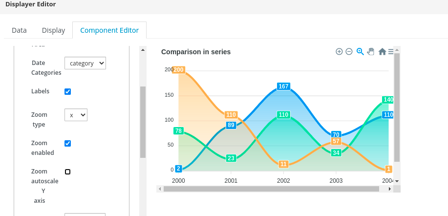
Click the Component Editor tab and update the following component properties into the Component Properties field:
Table 55.4. Time series component properties Component properties Description Transpose dataset
Define that the provided data set uses the time series as separate columns or as rows.
Show Area
Select the checkbox to set the type as a line chart or an area chart.
Date Categories
Select the category, datetime, or numeric option from the drop-down list.
Labels
Select the checkbox to enable or disable the data labels on data points.
Zoom type
Select the x, y, or xy option from the drop-down list.
Zoom enabled
Select the checkbox to enable zooming in axis charts. By default, the checkbox is checked.
Zoom autoscale Y axis
Select the checkbox to re-scale highs and lows based on visible area.
Toolbar Auto Selected
Select the zoom, selection, or pan option from the drop-down list.
Title text
Edit the title of the time series chart component.
Title align
Select the left, center, or right option from the drop-down list to change the title alignment.
Show toolbar
It is a checkbox to enable or disable the toolbar on the upper-right corner of the chart. By default, this checkbox is checked. If this component property is enabled, you can use the zoom in, zoom out, selection zoom, and panning functions of the time series chart component.
Chart Name
Set the chart name as per your requirements. By default, the chart name is set as Newchart.
- Optional: Click the sandwich menu icon in the upper-right corner of the chart to download the data set in CSV, PNG, or SVG format.
Click OK.
Figure 55.2. Example time series component
55.5. Heatmap components
In Business Central, you can add heatmap components to a page. Heatmap components are used to display heat information over a process diagram. The color on the process diagram nodes is related to the value you assign to each node and based on the assigned value, the color varies on a process diagram. If the assigned value is maximum, the heat intensifies and if a minimum value is assigned, then heat is not displayed on the process diagram.
You can export the heatmap components to Dashbuilder Runtime or Dashbuilder Standalone and retrieve the heat information from a KIE Server data set. You can also create, edit, and build a dashboard using a heatmap component.
55.5.1. Creating heatmap components for a process
You can create heatmap components for a specific process in Business Central.
Prerequisites
- KIE Server is deployed and connected to Business Central.
- You have created a project with at least one business process asset in Business Central.
- A project with a process definition has been deployed in Business Central.
- Sample process instances are created.
Procedure
Create a new KIE Server data set using the following steps:
In Business Central, go to Admin
Data Sets. The Data Set Explorer page opens.
Click New Data Set and select the Execution Server provider type.
The Data Set Creation Wizard page opens.
- Enter the name of the dataset.
- Select the server configuration. The server configuration is available if the project is deployed.
- Select CUSTOM query target from the list.
In the Query field, enter the following custom SQL query.
select pil.externalId, pil.processId, nil.nodeid, nil.nodetype, nil.nodename, count(nil.nodeid) as total_hits from NodeInstanceLog nil inner join ProcessInstanceLog pil on pil.processInstanceId = nil.processInstanceId where nil.type = 1 group by pil.externalId, nil.nodeid, nil.nodenameNoteYou can modify the SQL query according to your database if required.
- Complete the Data Set Creation Wizard and click Test.
- Click Save.
-
In Business Central, go to Menu
Design Pages. - In the Pages panel, click New.
- In the New Page dialog box, enter a value in the Name field and select the required style.
Click OK.
The new page opens in the Page Editor and you can see that the Heatmaps component is available under the Components panel.
- In the Components panel, expand the Heatmaps components and drag the Process Heatmap component type to the Page Editor.
- In the Displayer editor wizard, click Data tab and select the newly created KIE Server dataset.
- In the Data tab, select NODEID and TOTAL_HITS from the Columns field.
Click the Component Editor tab and enter the values for the mandatory fields including Server Template, Container ID, and Process Definition ID into the Component Properties field.
NoteTo access the value of Server Template, go to Deploy
Execution Servers Server Configurations. For the value of Container ID, go to Manage Process Instances, you can click on the process instance you want to use and in the, Deployment corresponds to the Container ID and the Definition ID is the Process Definition ID. - Click the Display tab and edit the value of Chart, Margins, Filter, Refresh, and Columns as per your requirements.
Click OK.
Figure 55.3. Example process heatmap components
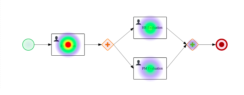
You can see the heat information on the process diagram.
55.5.2. Creating heatmap components for multiple processes
You can create heatmap components for multiple processes in Business Central.
Prerequisites
- KIE Server is deployed and connected to Business Central.
- You have created multiple projects in Business Central and it contains at least one business process asset.
- A project with a process definition has been deployed in Business Central.
- Sample process instances are created.
Procedure
Create a new KIE Server dataset using the following steps:
In Business Central, go to Admin
Data Sets. The Data Set Explorer page opens.
Click New Data Set and select the Execution Server provider type.
The Data Set Creation Wizard page opens.
- Enter the name of the dataset.
- Select the server configuration. The server configuration is available if the project is deployed.
- Select CUSTOM query target from the list.
In the Query field, enter the following custom SQL query.
select pil.externalId, pil.processId, nil.nodeid, nil.nodetype, nil.nodename, count(nil.nodeid) as total_hits from NodeInstanceLog nil inner join ProcessInstanceLog pil on pil.processInstanceId = nil.processInstanceId where nil.type = 1 group by pil.externalId, nil.nodeid, nil.nodenameNoteYou can modify the SQL query according to your database if required.
- Complete the Data Set Creation Wizard and click Test.
- Click Save.
-
In Business Central, go to Menu
Design Pages. - In the Pages panel, click New.
- In the New Page dialog box, enter a value in the Name field and select the required style.
Click OK.
The new page opens in the Page Editor and you can see that the Heatmaps component is available under the Components panel.
- In the Components panel, expand the Heatmaps components and drag the All Processes Heatmaps component type to the canvas.
- In the Displayer editor wizard, click Data tab and select the newly created KIE Server dataset.
- In the Data tab, select EXTERNALID, PROCESSID, NODEID, and TOTAL_HITS from the Columns field.
- In the Process Selector box, select the Container and Process values as per your requirement.
Click the Component Editor tab and enter the value in the Server Template (mandatory) field.
NoteTo access the value of Server Template, go to Deploy
Execution Servers Server Configurations. - Click the Display tab and edit the value of Chart, Margins, Filter, Refresh, and Columns as per your requirements.
Click +OK.
Figure 55.4. Example multiple processes heatmap components
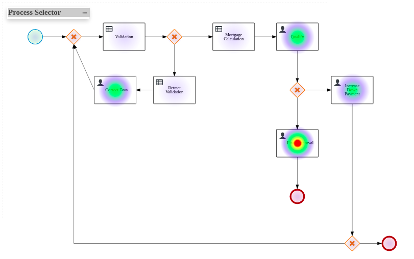
You can see the heat information on the process diagram.
55.5.3. Executing a heatmap component
You can execute the internal heatmap components locally, outside of Business Central for testing purpose only. The same API is used to create external components, which you can use to build your own components. For more information about external components, see Section 55.6, “External components”
To run the specific heatmap component, complete the following steps:
Prerequisites
- You have installed npm on your system. For more information about installing npm, see Downloading and installing Node.js and npm.
- You have installed Yarn on your system. For more information about installing Yarn, See Yarn Installation.
- You have cloned the Appformer repository to run the components outside of Business Central.
Procedure
-
Go to the
appformer/dashbuilder/dashbuilder-shared/dashbuilder-jsdirectory. Open the terminal in the
dashbuilder-jsdirectory and enter the following command:yarn run init && yarn run build:fast
You can see the following components are present in the
dashbuilder-js/packagesdirectory:- processes-heatmaps-component
- process-heatmap-component
- logo-component
- heatmap-component
Go to the
dashbuilder-js/packagesdirectory, open the desired heatmap component and enter the following command in the terminal:yarn run start
To access the component, enter http://localhost:9001/ in a web browser.
The selected component is displayed on the web browser.
55.6. External components
In Business Central, you can add external components to a page. The components are disabled by default. To enable the external components, change the value of dashbuilder.components.enable system property to true.
The external component location is set and configured with the dashbuilder.components.dir system property. The default value of this system property is /tmp/dashbuilder/components. You must set the component under the components directory with a parent directory, which is used as the component ID. For example, if the component ID is mycomp and the component directory is /tmp/dashbuilder/components, then the component base directory is /tmp/dashbuilder/components/mycomp.
Business Central checks the manifest.json file in the components directory. The manifest.json must contain at least one name text parameter.
| Parameter | Description |
|---|---|
|
| Name of the component displayed under Components section. |
|
| Icon of the component displayed under Components section. |
|
| A flag that indicates that the component does not require a data set. |
|
|
The list of parameters are using |
Sample manifest.json file
{
    "name": "Heat Map Experiment",
    "icon": "fa fa-bell-o",
    "parameters": [
        {
            "name": "svg",
            "type": "text",
            "defaultValue": "",
            "label": "SVG XML",
            "category": "SVG Content"
            "mandatory": true
        },
        {
            "name": "svgUrl",
            "type": "text",
            "defaultValue": "",
            "label": "SVG URL",
            "category": "SVG URL"
            "mandatory": true
        }
        ,
        {
            "name": "ksProcessId",
            "type": "text",
            "defaultValue": "",
            "label": "Process ID",
            "category": "Kie Server"
            "mandatory": true
        }
    ]
}
55.6.1. Creating external components
The following procedure describes how to create and add the external components to a page:
Procedure
Set the component under components directory with a parent directory.
For example, if the component ID is
mycompand the component directory is/tmp/dashbuilder/components, then the component base directory is/tmp/dashbuilder/components/mycomp.-
Create the
manifest.jsonfile in the component directory. -
Create
index.htmlfile with HTML content. -
In a terminal application, navigate to
EAP_HOME/bin. To enable the external components, set the value of
dashbuilder.components.enablesystem property totrue:$ ~/EAP_HOME/bin/standalone.sh -c standalone-full.xml -Ddashbuilder.components.dir={component directory base path} -Ddashbuilder.components.enable=trueStart Business Central, go to Menu
Design Pages. External Components is available under Components pane.
- In the Components pane, expand the External Components and drag the required component types to the canvas.
- Click Save.