 Red Hat Summit
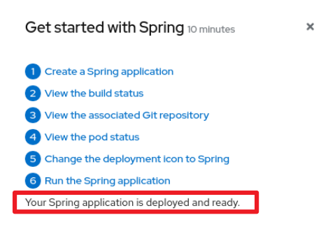
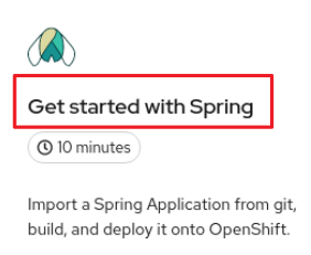
8.5. Quick start content guidelines
8.5.1. Card copy
You can customize the title and description on a quick start card, but you cannot customize the status.
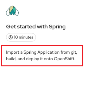
- Keep your description to one to two sentences.
Start with a verb and communicate the goal of the user. Correct example:
Create a serverless application.
8.5.2. Introduction
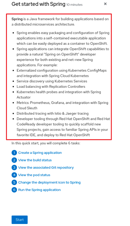
After clicking a quick start card, a side panel slides in that introduces the quick start and lists the tasks within it.
- Make your introduction content clear, concise, informative, and friendly.
- State the outcome of the quick start. A user should understand the purpose of the quick start before they begin.
Give action to the user, not the quick start.
Correct example:
In this quick start, you will deploy a sample application to {product-title}.Incorrect example:
This quick start shows you how to deploy a sample application to {product-title}.
- The introduction should be a maximum of four to five sentences, depending on the complexity of the feature. A long introduction can overwhelm the user.
List the quick start tasks after the introduction content, and start each task with a verb. Do not specify the number of tasks because the copy would need to be updated every time a task is added or removed.
Correct example:
Tasks to complete: Create a serverless application; Connect an event source; Force a new revisionIncorrect example:
You will complete these 3 tasks: Creating a serverless application; Connecting an event source; Forcing a new revision
8.5.3. Task steps
After the user clicks Start, a series of steps appears that they must perform to complete the quick start.
Follow these general guidelines when writing task steps:
- Use "Click" for buttons and labels. Use "Select" for checkboxes, radio buttons, and drop-down menus.
Use "Click" instead of "Click on"
Correct example:
Click OK.Incorrect example:
Click on the OK button.
Tell users how to navigate between Administrator and Developer perspectives. Even if you think a user might already be in the appropriate perspective, give them instructions on how to get there so that they are definitely where they need to be.
Examples:
Enter the Developer perspective: In the main navigation, click the dropdown menu and select Developer.
Enter the Administrator perspective: In the main navigation, click the dropdown menu and select Admin.
Use the "Location, action" structure. Tell a user where to go before telling them what to do.
Correct example:
In the node.js deployment, hover over the icon.Incorrect example:
Hover over the icon in the node.js deployment.
- Keep your product terminology capitalization consistent.
- If you must specify a menu type or list as a dropdown, write "dropdown” as one word without a hyphen.
Clearly distinguish between a user action and additional information on product functionality.
User action:
Change the time range of the dashboard by clicking the dropdown menu and selecting time range.Additional information:
To look at data in a specific time frame, you can change the time range of the dashboard.
Avoid directional language, like "In the top-right corner, click the icon". Directional language becomes outdated every time UI layouts change. Also, a direction for desktop users might not be accurate for users with a different screen size. Instead, identify something using its name.
Correct example:
In the navigation menu, click Settings.Incorrect example:
In the left-hand menu, click Settings.
Do not identify items by color alone, like "Click the gray circle". Color identifiers are not useful for sight-limited users, especially colorblind users. Instead, identify an item using its name or copy, like button copy.
Correct example:
The success message indicates a connection.Incorrect example:
The message with a green icon indicates a connection.
Use the second-person point of view, you, consistently:
Correct example:
Set up your environment.Incorrect example:
Let's set up our environment.
8.5.4. Check your work module
After a user completes a step, a Check your work module appears. This module prompts the user to answer a yes or no question about the step results, which gives them the opportunity to review their work. For this module, you only need to write a single yes or no question.
- If the user answers Yes, a check mark will appear.
- If the user answers No, an error message appears with a link to relevant documentation, if necessary. The user then has the opportunity to go back and try again.
8.5.5. Formatting UI elements
Format UI elements using these guidelines:
- Copy for buttons, dropdowns, tabs, fields, and other UI controls: Write the copy as it appears in the UI and bold it.
- All other UI elements—including page, window, and panel names: Write the copy as it appears in the UI and bold it.
- Code or user-entered text: Use monospaced font.
- Hints: If a hint to a navigation or masthead element is included, style the text as you would a link.
- CLI commands: Use monospaced font.
- In running text, use a bold, monospaced font for a command.
- If a parameter or option is a variable value, use an italic monospaced font.
- Use a bold, monospaced font for the parameter and a monospaced font for the option.
'%20d='M201.5%20305.5c-13.8%200-24.9-11.1-24.9-24.6%200-13.8%2011.1-24.9%2024.9-24.9%2013.6%200%2024.6%2011.1%2024.6%2024.9%200%2013.6-11.1%2024.6-24.6%2024.6zM504%20256c0%20137-111%20248-248%20248S8%20393%208%20256%20119%208%20256%208s248%20111%20248%20248zm-132.3-41.2c-9.4%200-17.7%203.9-23.8%2010-22.4-15.5-52.6-25.5-86.1-26.6l17.4-78.3%2055.4%2012.5c0%2013.6%2011.1%2024.6%2024.6%2024.6%2013.8%200%2024.9-11.3%2024.9-24.9s-11.1-24.9-24.9-24.9c-9.7%200-18%205.8-22.1%2013.8l-61.2-13.6c-3-.8-6.1%201.4-6.9%204.4l-19.1%2086.4c-33.2%201.4-63.1%2011.3-85.5%2026.8-6.1-6.4-14.7-10.2-24.1-10.2-34.9%200-46.3%2046.9-14.4%2062.8-1.1%205-1.7%2010.2-1.7%2015.5%200%2052.6%2059.2%2095.2%20132%2095.2%2073.1%200%20132.3-42.6%20132.3-95.2%200-5.3-.6-10.8-1.9-15.8%2031.3-16%2019.8-62.5-14.9-62.5zM302.8%20331c-18.2%2018.2-76.1%2017.9-93.6%200-2.2-2.2-6.1-2.2-8.3%200-2.5%202.5-2.5%206.4%200%208.6%2022.8%2022.8%2087.3%2022.8%20110.2%200%202.5-2.2%202.5-6.1%200-8.6-2.2-2.2-6.1-2.2-8.3%200zm7.7-75c-13.6%200-24.6%2011.1-24.6%2024.9%200%2013.6%2011.1%2024.6%2024.6%2024.6%2013.8%200%2024.9-11.1%2024.9-24.6%200-13.8-11-24.9-24.9-24.9z'/%3e%3c/svg%3e)