19.2. Viewing Metrics and Baseline Charts
The core of monitoring is the metric information that is collected for a resource. Each resource has different metrics (and these are listed in the Resource Reference: Monitoring, Operation, and Configuration Options). Three monitoring charts show the same information, but in different perspectives and different levels of detail:
- The resource-level Summary
- Graphs
- Tables
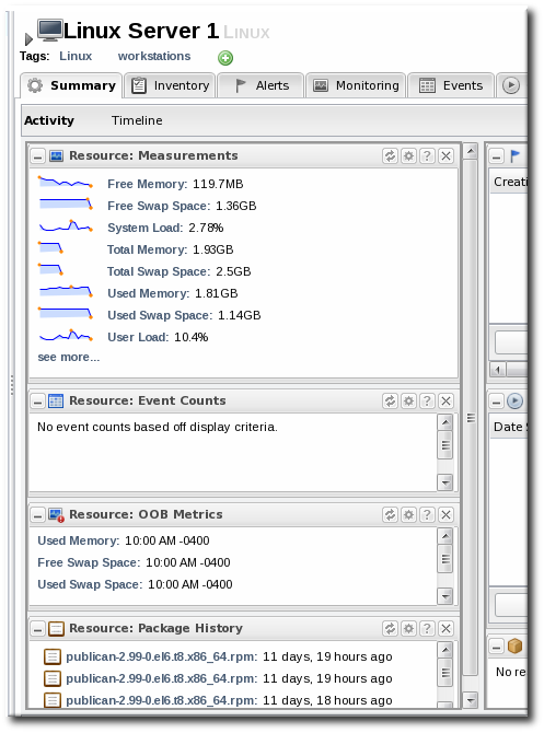
The Summary tab for resources, much like the Dashboard for the entire JBoss ON inventory, has portlets that show different resource information. Most resources have three portlets for measurements, events, and out-of-bound metrics. The Measurements portlet has small thumbnail charts that show the trend for the metric, along with the current reading.

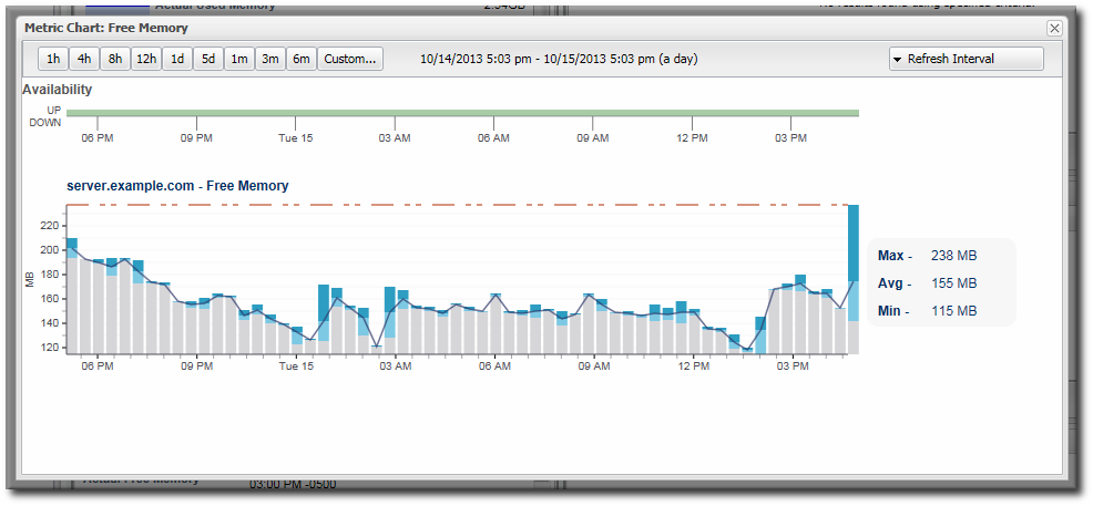
Clicking any of the metrics will open the baseline chart for that metric. As is described in Section 19.1.4, “Baselines and Out-of-Bounds Metrics”, baselines calculate an average reading for a given period of time, with the high and low measurements in that period creating upper and lower bounds. Baselines, by default, are calculated every three days using the data from the previous seven days for the calculation. Baseline measurements are essential for establishing operating norms so that administrators can effectively set alerts for resources.

Figure 19.6. Individual Metric Graph
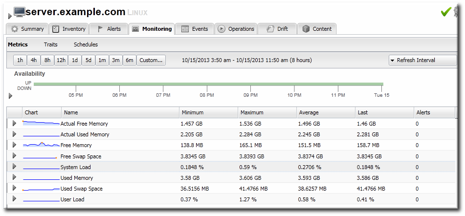
The Metrics area in the Monitoring tab shows all of the metrics in a table, with columns for the high, low, and current readings. There is also a column which shows the number of active alerts for each metric.

Figure 19.7. Metrics Table
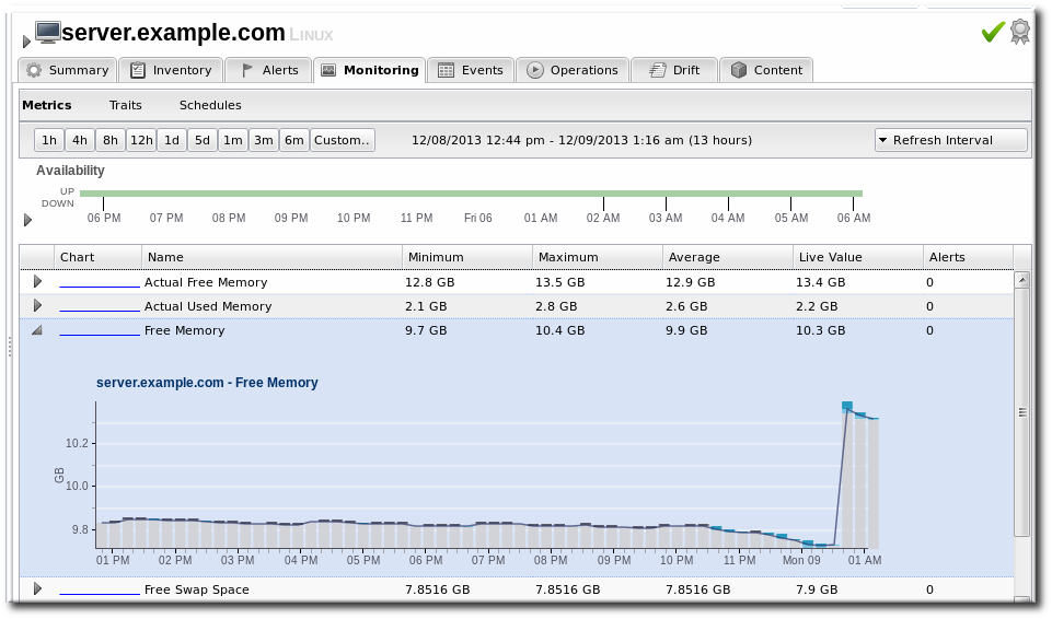
Expanding a metric opens its individual metric graph, giving the trend for the past eight hours. This provides more granular detail than the summary or baselines charts, showing the readings for each collection period and the precise readings.

Figure 19.8. Metric Graph within the Table